Research Draft
The Problem, In One Paragraph
Kubernetes clusters replace their nodes all the time: security patches, version upgrades, autoscaling, and immutable-infrastructure rollouts all swap old nodes for fresh ones. Every fresh node starts with an empty image cache. So when a CI/CD job lands on a new node, it can’t start right away, it has to wait for its container image to download first. Multiply that wait across a busy workday and you get real, measurable developer frustration: pipelines that feel slow for no obvious reason.
This research answers three questions precisely:
- How many jobs actually wait?
- How long do they wait?
- When do they wait, and does that timing matter to developers?
The rest of this page builds up the answer gently, first with a kitchen analogy, then one fully worked example, and only then the formulas, each with a plain-language explanation of what it tells you and when you’d reach for it.
Think Of It As A Kitchen
The easiest way to hold the whole model in your head is to picture a restaurant kitchen during service.
| In the kitchen | In your cluster |
|---|---|
| A food order | A CI/CD job |
| The ingredients a dish needs | The OCI image a job needs |
| Cold station: ingredients not prepped yet | Node without the image cached |
| Warm station: ready to assemble immediately | Node with the image already cached |
| Prep time before you can cook | Pull-time : how long the image takes to download |
| An order that arrives mid-prep and has to wait | An affected job |
| A station finishing prep for the first time | A newly warmed node |
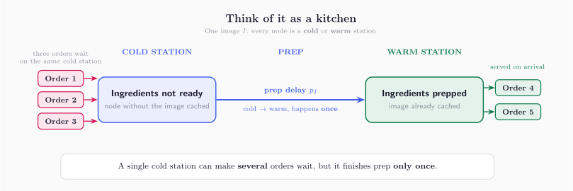
Here is the one idea everything else rests on:
A single cold station can make several food orders wait, but it only finishes prep once.
That gap, many waiting orders versus one prep event, is exactly why the model has to count two different things. It’s also the source of almost every subtle result later on, so it’s worth pausing on.
One Worked Example, Start To Finish
Before any general formulas, let’s walk through a small, concrete case. We’ll reuse these same numbers for the rest of the page so nothing stays abstract:
- 10 nodes are available to run jobs ().
- 6 of them are cold for our image right now ().
- 5 jobs arrive together, all needing that same image ().
- The image takes 60 seconds to pull (s).
Every eligible node is either warm or cold for this one image, and the two counts always add up to the whole pool: . Here that’s .
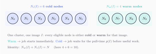
How many jobs wait?
Each of the 5 jobs is equally likely to land on any of the 10 nodes, and 6 of those 10 are cold. So each job has a 6-in-10 chance of hitting a cold node. Multiply that probability across the 5 jobs:
On an average day, 3 of the 5 jobs wait for a pull. That’s the number a developer would feel.
How many nodes actually warm up?
You might expect “3 jobs waited, so 3 nodes warmed up.” Not quite, because two of those jobs might land on the same cold node. Counting only the distinct nodes that get hit at least once:
About 2.46 nodes warm up, fewer than the 3 jobs that waited. That difference is the kitchen insight in numbers: several orders can pile up behind the same station.
Turning waiting into a number you can compare
Waiting becomes useful once you can add it up across jobs. If 3 jobs each wait 60 seconds, that’s 3 job-minutes of developer waiting:
Notice this is aggregate waiting across jobs, not wall-clock time. Three jobs each waiting a minute in parallel is still 3 job-minutes of exposure, even though only one minute passes on the clock. Job-minutes is the currency we use to compare strategies fairly.
Why We Count Two Things, Not One
It’s tempting to track a single number. But the two below answer genuinely different questions, and reaching for the wrong one leads to wrong conclusions:
- Affected jobs — how many jobs felt the delay. This is the developer-facing pain.
- Newly warmed nodes — how much your cache actually filled up. This is infrastructure progress.
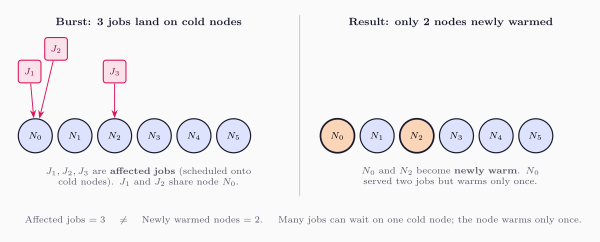
Count only warmed nodes and you’ll understate how much developers suffered. Count only affected jobs and you’ll miss how much warming progress you made. The model keeps both in view on purpose.
How Jobs Arrive Changes Everything
The same cluster, in the same cold state, can produce wildly different amounts of waiting depending on how the jobs show up. Three patterns are worth knowing.
Jobs trickle in (sequential)
Orders arrive one at a time, with enough breathing room that prep for an early order finishes before the next one needs it. Warming genuinely helps the jobs behind it.
You’ll see this during quiet periods, low concurrency, or deliberately serialized pipelines.
Jobs arrive all at once (burst)
The whole rush hits before any prep can finish, so every order sees the same cold kitchen. This is the worst case for a given cold-node count.
You’ll see this with fan-out test stages, scheduled batch runs, or everyone pushing right before a deadline.
Jobs keep flowing (rolling concurrency)
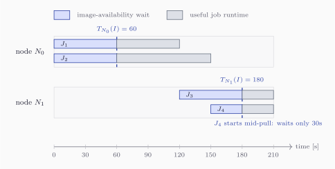
Real service lives in between: new orders keep arriving while prep is already underway. Some orders wait the full prep time; some arrive partway through and only wait for whatever’s left.
Here is how long job waits, is when it’s scheduled, is when its node finishes pulling, and is the job’s own runtime once it can finally start.
The three patterns always line up in the same order, from least to most waiting:
In words: trickle is best, all-at-once is worst, and reality sits between them. That’s the sanity check to keep in your head.
Seeing the three patterns on one tiny example
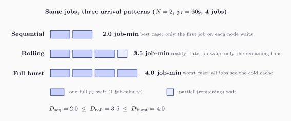
It’s worth watching the bound come alive on numbers you can check by hand. Take 2 nodes, a concurrency limit of 2 active jobs, a 60-second pull, and 4 jobs that all need the image. Both nodes start cold. The jobs land , in that order.
Under rolling concurrency the timeline plays out like this:
| Job | Scheduled | Node | Node ready | Waits | Runtime | Finishes |
|---|---|---|---|---|---|---|
| 0 | 60 | 60 | 60 | 120 | ||
| 0 | 60 | 60 | 90 | 150 | ||
| 120 | 180 | 60 | 30 | 210 | ||
| 150 | 180 | 30 | 30 | 210 |
and both hit cold and each wait the full minute. opens and waits a full minute too. But arrives 30 seconds after started the pull, so it only waits for the remaining 30 seconds. Add the waits up: seconds, or 3.5 job-minutes.
Run the exact same jobs as a pure trickle and you get 2.0 job-minutes; run them as one all-at-once burst and you get 4.0. Rolling reality lands neatly in between.
Why We Bother With Variance
An average is comforting but incomplete. “3 jobs wait on average” doesn’t tell you whether tomorrow will be a calm 2 or a painful 5. That spread is what variance measures.
For the burst case:
and the standard deviation puts that spread back into the same units as the count itself, so you can read it as “give or take a job or two.”
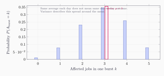
Read the two together:
- The average tells you what a typical day looks like.
- The variance tells you how bumpy the ride is, how far real days stray from that typical one.
This matters because planning is really about the bad days, not the average ones. Two prewarming strategies can share the same average savings while one of them hides ugly, unpredictable spikes. Compare only the averages and you’d never see it coming.
Not All Waiting Hurts Equally
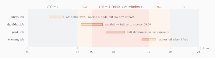
A one-minute wait at 3 a.m., when nobody is watching a pipeline, costs almost nothing. The same wait at 2 p.m., when a developer is staring at CI before they can merge, costs a lot. The model captures this by weighting each moment of waiting by how much developers care about that time of day:
The weight is high during working hours (say, full weight from 09:00 to 17:00) and low or zero overnight. So instead of “how many minutes did jobs wait,” this asks “how many minutes did jobs wait when it actually mattered.”
A Full Day, From Rotation To Standup
The small examples make the mechanics clear. Now let’s run the model on a realistic day so the numbers mean something. Picture a dedicated CI node pool:
- 100 eligible nodes and 25,000 CI jobs across the day.
- One image we care about is 2% of traffic, and it takes 60 seconds to pull cold.
- At 00:00 the whole pool is rotated for maintenance. Every node comes back healthy but with an empty cache, so is cold on all 100 nodes.
- Developers start pushing when the feedback window opens at 09:00.
Between midnight and 09:00 about 70.7 jobs happen to use image . Each one that lands on a cold node warms it, so by 09:00 the ordinary overnight traffic has quietly warmed roughly 50.9 nodes on its own, entirely for free.
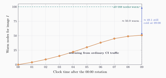
That sounds encouraging until you flip it around: about 49.1 nodes are still cold exactly when developers arrive and , the moment waiting hurts most. The next 500 developer-window jobs that use run straight into that half-cold pool.
How much waiting does that create? It depends entirely on how those 500 jobs arrive, and the same three patterns from before give three very different answers:
| Arrival pattern | Affected job-minutes | Reading |
|---|---|---|
| Sequential (best case) | 48.78 | jobs spaced out; warming keeps helping |
| Rolling concurrency (realistic) | 76.94 | jobs overlap; some warming still helps |
| Full burst (worst case) | 245.50 | everyone hits the half-cold pool at once |
Reality sits at the rolling figure, about 77 job-minutes of developer waiting from a single image after one rotation. Spread across 100 developers that averages under a minute each, but it isn’t spread evenly, it lands hard on whoever’s pipeline needed that image first thing in the morning.
The Portfolio View: One Image Was Just The Warm-Up
A real cluster doesn’t run one image, it runs hundreds: language runtimes, build images, test images, deployment tooling, project-specific images. Each one has its own cold-node cost after a rotation. Summing them gives the total developer cost of a cold cache:
Here is the waiting caused by a single image , and the portfolio total sums over every image the cluster uses.
Run the same midnight-rotation scenario across a 30-image portfolio and the single-image story changes scale completely. That one image cost about 77 job-minutes; the whole portfolio costs about 1,512 job-minutes, roughly 25 developer job-hours, in the window after just one rotation.
But here’s the part that makes prewarming practical: the cost is deeply lopsided. The top 5 images alone account for 579 job-minutes, and the top 10 for 923, more than 60% of the total from a third of the images.
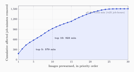
That steep early slope is the whole argument. You can’t prewarm everything, pulling images costs bandwidth and time too. So prewarming becomes a ranking problem: spend your budget on the images that remove the most waiting.
Back to the kitchen: if you can only prep a few ingredients before the rush, prep the ones that show up in the most orders, not the exotic garnish used once a night. That’s exactly what the curve above says, and it’s why the next question is how to figure out which images those are.
Where The Kubernetes Scheduler Fits In
One honest caveat before ranking. The clean example assumed jobs land on nodes uniformly at random. Real Kubernetes scheduling isn’t random, it scores nodes, and one of those scores is ImageLocality, which nudges Pods toward nodes that already have their image. You might hope that solves cold-cache waiting on its own. It helps, but it can’t be relied on, for two reasons.
First, ImageLocality is a score, not a guarantee. Resource fit, topology spread, affinity, and taints can all outweigh it.
Second, and more subtly, the scheduler and the runtime don’t always agree on what “warm” means:
- Runtime-warm is what actually matters: the image is on the node’s disk and ready for container startup.
- Scheduler-visible is what the scheduler can see: images reported in the node’s status. That list is capped by
nodeStatusMaxImages(default 50).
A node can be genuinely warm for your image yet not advertise it, so ImageLocality never steers work its way. That’s why the model measures runtime cold-node exposure directly, counting a job as affected whenever it’s scheduled onto a node where the image isn’t ready for startup, rather than trusting the scheduler to route around cold nodes.
Turning Signals Into A Ranking
To act on the portfolio idea, Drop has to decide which images matter most. That happens in a small pipeline:

Raw observations (from Prometheus, Kubernetes events, and job metadata) get boiled down into signals, and the signals get combined into a ranking. The nice thing is you can start with signals that need nothing more than image-usage history, and add sophistication only when it pays off:
| Strategy | Score | What it’s good at |
|---|---|---|
| Count | Simplest possible: rank by total usage. Robust, easy, a fine first deploy. | |
| Dev-weighted count | Prefers images used during working hours, when waiting actually hurts. | |
| Recent count | Adapts fast when usage shifts, but can overreact to short spikes. | |
| Peak concurrency | Catches images that appear in tight fan-out bursts, even off-hours. | |
| Hybrid | Balances general popularity with burst-awareness. | |
| Model-aware exposure | Estimates the waiting an image will cause, not just how often it’s used. |
The first five rank by some flavor of “how often is this image used.” The last one is different, and it’s the most powerful: it multiplies expected developer demand, the fraction of nodes likely still cold, and the measured pull cost. That turns “popular image” into “image most likely to make people wait”, which is what you actually want to prewarm. The catch is that it needs a measured pull-time estimate , so it’s a step up in what your cluster has to observe.
Prewarming And Mirroring Solve Different Problems
A quick but important detour, because these two are easy to confuse. Prewarming isn’t the only tool for cold caches; cluster-local mirrors like Spegel also help. But they help in genuinely different ways, and knowing which is which keeps you from expecting one to do the other’s job.
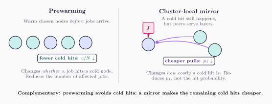
- Prewarming changes whether a job hits a cold node. It warms chosen nodes before jobs arrive, so fewer jobs wait at all, it pushes the cold fraction down.
- A cluster-local mirror changes how expensive a cold hit is. The job still lands cold, but neighboring nodes serve the layers, so the pull is cheaper, it pushes down.
They’re complementary, not competing. Prewarming avoids cold hits; a mirror makes the ones you couldn’t avoid hurt less. The strongest results come from using both.
How You’d Validate This On A Real Cluster
Everything above is a model. Before trusting it operationally, you’d measure two things on a real cluster, and it genuinely takes two, because one alone can’t answer the question.
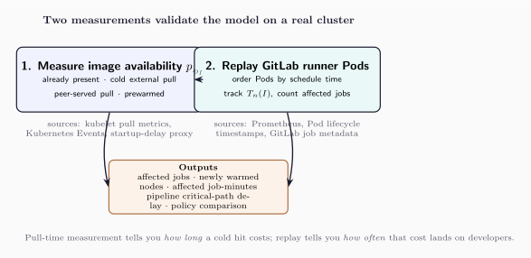
- Measure image availability . How long does the image actually take to become usable on a node, when it’s already present, pulled cold from the registry, served by a peer mirror, or prewarmed? This comes from kubelet pull metrics, Kubernetes Events, or a scheduling-to-startup proxy.
- Replay real GitLab runner Pods. Take a full day of runner Pods ordered by schedule time, track when each node’s image becomes ready, and count how many jobs hit cold nodes and for how long. This comes from Prometheus, Pod lifecycle timestamps, and GitLab job metadata.
The split matters: pull-time measurement tells you how long a cold hit costs, and replay tells you how often that cost actually lands on a developer. You need both to turn the model’s job-minutes into a claim you can defend.
What The Numbers Actually Show
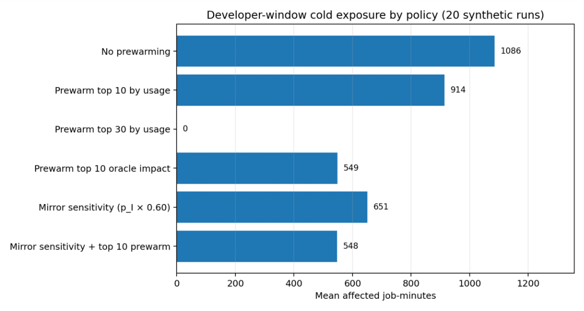
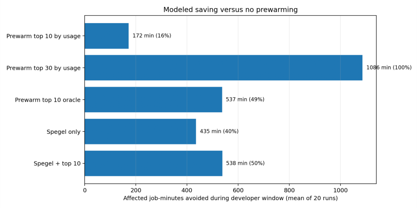
To exercise the replay method before production data is available, it was run on 20 independently generated synthetic days, each with 25,000 jobs, 100 nodes, and 30 images. These are a methodology sanity check, not proof of universal savings, but they show the shape of the comparisons the method produces.
Does prewarming help, and how much?
| Policy | Affected jobs | Job-minutes | Saved vs. no prewarm | Mean P95 wait |
|---|---|---|---|---|
| No prewarming | 1,271 | 1,086 | — | 31.9s |
| Prewarm top 10 by usage | 1,075 | 914 | 15.8% | 8.0s |
| Prewarm top 30 by usage | 0 | 0 | 100.0% | 0.0s |
| Prewarm top 10 oracle impact | 843 | 549 | 49.5% | 0.0s |
| Mirror sensitivity, | 1,268 | 651 | 40.1% | 19.1s |
| Mirror + top 10 prewarm | 1,073 | 548 | 49.6% | 4.8s |
A few things jump out. Warming the whole portfolio removes all waiting (it’s the trivial upper bound). A plain top-10-by-usage ranking removes about 16%, but the oracle that ranks by true impact removes 49% from the same 10 images, so the ranking you choose matters as much as how many images you warm. And combining a mirror with prewarming gets you nearly to the oracle, because the two mechanisms attack different halves of the problem.
Which ranking strategy helps most?
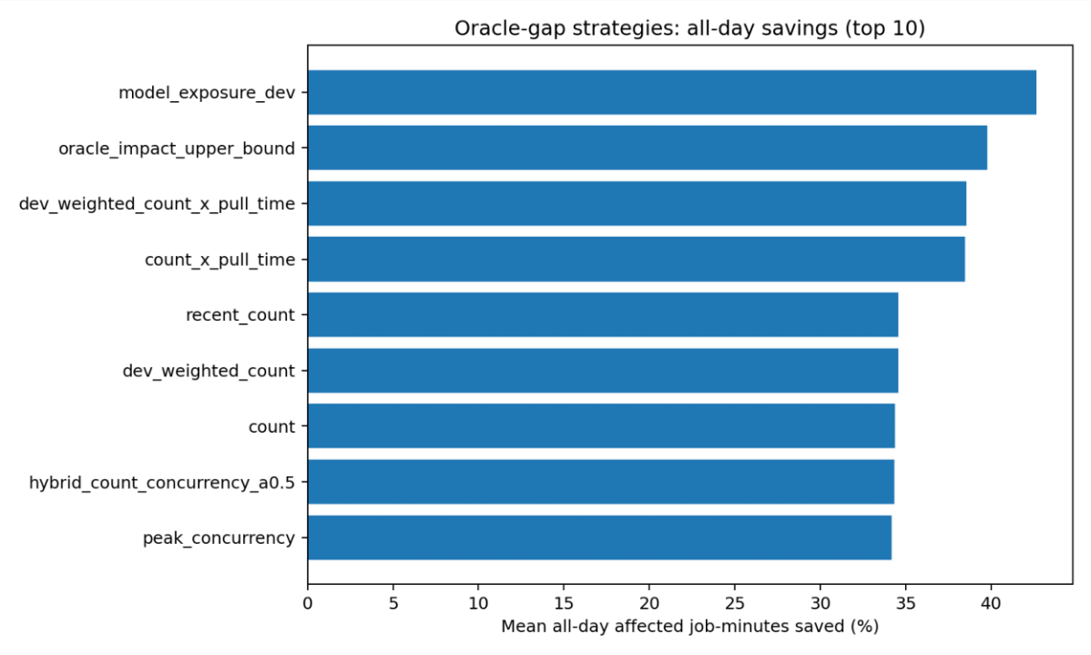
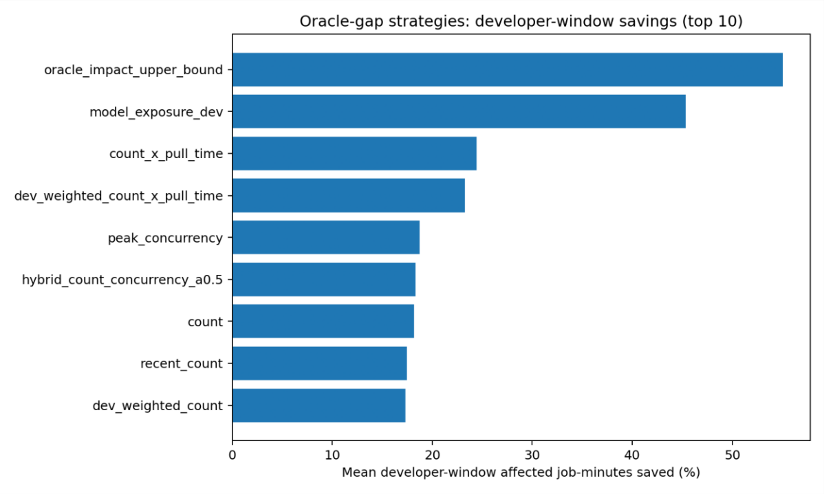
The “oracle gap” is how far each real, deployable strategy sits below a perfect-knowledge baseline, in other words how much waiting is left on the table by not knowing the future.
| Strategy | Dev-window saved | Dev affected min | Oracle overlap |
|---|---|---|---|
| Oracle impact (upper bound) | 55.1% | 423 | 10.0/10 |
| Model-aware exposure | 45.3% | 513 | 5.7/10 |
| Count × pull time | 24.4% | 710 | 2.25/10 |
| Dev-weighted count × pull time | 23.3% | 721 | 1.95/10 |
| Peak concurrency | 18.7% | 765 | 0.85/10 |
| Count | 18.2% | 771 | 0.80/10 |
| Recent count | 17.5% | 777 | 0.65/10 |
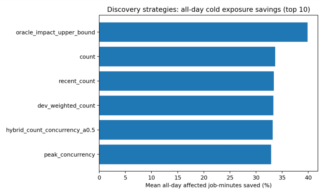
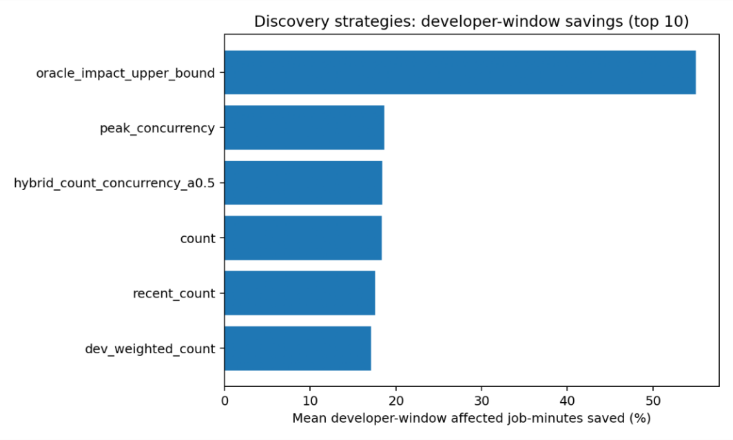
The story is a clean maturity ladder. Usage-only strategies all cluster around 17–19% developer-window savings, they’re safe first deploys that need only Prometheus. Adding measured pull-time roughly doubles the benefit. And the model-aware exposure score, which folds in demand, cold fraction, and pull cost, closes most of the gap to the oracle. More measurement buys better ranking.
Go Deeper
The full paper contains the complete derivations, proofs of the arrival-mode bounds, and the real-cluster replay methodology.
- Paper (PDF, research draft): /research/paper/paper.pdf
- Paper source (TeX): /research/paper/paper.tex
The underlying data
- /research/models/strategy_summary_top10.csv — best strategies and their savings
- /research/models/strategy_comparison_all_runs.csv — every strategy across every run
- /research/models/oracle_gap_strategy_summary_top10.csv — gap to the perfect-knowledge baseline
- /research/models/oracle_gap_strategy_comparison_all_runs.csv — that gap, across all runs
- /research/models/policy_comparison_concise_20runs.csv — policy comparison summary
Running The Benchmark Yourself
The results above come from a small pandas-based evaluator that replays a full day of CI jobs against different cache policies. You can reproduce them, or point the same tooling at your own cluster.
Everything lives in research/benchmark/evaluator/. Set it up once:
cd research/benchmark/evaluator
python -m venv .venv && . .venv/bin/activate
pip install -r requirements.txt
Reproduce the synthetic results
Generate a 25,000-job day, replay the policies, and evaluate the discovery rankings:
python generate_synthetic_day.py --out data --jobs 25000 --nodes 100 --images 30 --seed 20260621
python evaluate_replay.py --data data --out outputs
python evaluate_discovery_strategies.py --data data --out outputs/strategy_eval
This writes outputs/policy_summary.csv (the policy comparison), outputs/image_impact_no_prewarm.csv (images ranked by affected job-minutes), and outputs/strategy_eval/strategy_comparison.csv (the discovery-strategy table). The synthetic day is deliberately randomized and not tuned to favor prewarming.
Run it against your own cluster
The easiest path is to let the fetcher build every input CSV for you. Point it at your cluster’s Prometheus and Loki and it does the rest:
# Port-forward Prometheus and Loki, then:
python fetch_cluster_data.py \
  --prometheus-url http://localhost:9090 \
  --loki-url       http://localhost:3100 \
  --lookback 24h --out data
It assumes Kubernetes events reach Loki through Grafana Alloy (loki.source.kubernetes_events) and that per-Pod placement comes from kube-state-metrics. From those it derives per-image pull times, reconstructs the runner jobs, and captures image-usage over time — writing images.csv, gitlab_runner_jobs.csv, prometheus_image_samples_5m.csv, and kubernetes_events.csv. The default queries target GitLab executor pods (pod=~"runner-.*"); override --pod-selector, --loki-query, or --usage-query when your labels differ. Then run the same evaluate_replay.py and evaluate_discovery_strategies.py commands against that directory.
Prefer to assemble the data yourself? Supply a single gitlab_runner_jobs.csv with a row per runner Pod:
job_id,pipeline_id,stage,pod,namespace,node,image_id,image,digest,
pod_created,pod_scheduled,container_started,job_script_started,job_finished,
p50_pull_seconds,useful_runtime_seconds
Most of it comes from data you likely already collect: pod_scheduled and container_started from kube-state-metrics or Pod status, image and node from kube_pod_container_info / kube_pod_info, Pulling/Pulled timings from a Kubernetes event exporter, and job_id / pipeline_id from GitLab job metadata. If you can’t get exact pull durations, use startup_delay = container_started − pod_scheduled as a conservative proxy. Then run the same evaluate_replay.py and evaluate_discovery_strategies.py commands against your data directory.
See research/benchmark/evaluator/README.md for the full column reference, replay semantics, and the list of policies and strategies evaluated.
Regenerate the concept graphics
The TikZ figures on this page are built separately from their sources:
make static